Messages in the Public Realm
2023 Creative in Residence, Owen Marshall, discusses his artistic process with Dave Dyment
August 10, 2023
The annual Ontario Culture Days’ Creatives in Residence series invites artists to develop community-engaged projects to be presented during the fall Festival. This year’s lineup of residents explore themes of material culture.
Owen Marshall is an artist and printmaker based in Toronto. His work examines the way text and signage influence the surrounding environment.
Dave Dyment: Can we start with you describing the work you’ll be presenting for Ontario Culture Days?
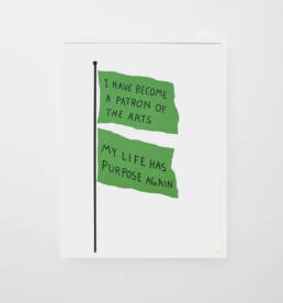
Owen Marshall: The project is an extension of a print series I did for Ninth Editions a few years back – a screenprint series of illustrated flags with text on them. For Ontario Culture Days, the plan is to take the text from some of those prints and turn them into full-sized flags and put them out in public around Toronto.
DD: How does the work change when they become actualized rather than as drawn or painted imagined flags?
OM: Well, I see it as an extension of the printmaking process – creating them in real form is just an expansion from this kind of fine art printmaking into a more practical, physical, industrial printmaking, and then bringing them out at full scale. It gives them a new shape and offers a new way to engage and experience them. I haven’t seen them yet myself – so they’re all still hypothetical right now, which is kind of fun – but I’m excited to see how they change and how people can actually interact with them when they’re out in the world.
DD: One of the things that I am drawn to about your practice is the way that you combine vernacular language with the authority of signage. Am I right in thinking that this interplay is crucial to your work?
OM: Yeah, I also think it’s really fun. People have a pre-existing relationship with signage and flags, and there’s a lot of opportunity to take that kind of iconic visual language associated with those objects and twist it in a way that people aren’t looking for. Especially with street signs. There’s kind of an unspoken trust between you and the signs. But when you see they’ve been changed and that trust is questioned or broken, that can be a lot of fun. There’s a lot of poetry from just making simple changes in the text and the way that you engage with them. But yeah, I like the idea of artworks having this kind of surprise, like an interaction with something that you weren’t expecting that you’ve been engaging with in a very standard kind of mundane way for your entire life.
DD: I think of that as being opened up by artists in the 1980s and even ‘70s: Jenny Holzer’s Jumbotron and Barbara Kruger’s billboards, and a decade prior to that Yoko Ono and John Lennon’s War Is Over billboards. But I guess the question would be what sort of future potential for public sites did these artists reveal, or make way for?
OM: I think what they’ve done is changed the terms in which the public engages with art. By taking it outside of a gallery setting and putting it in this environment it’s almost forcing people to interact with art who otherwise wouldn’t. It opens it up to a much larger audience and allows for a much broader interpretation of the work.
When you have public murals, public artworks, works involving – especially in the case of Jenny Holzer – some pretty dramatic, intense texts – they’re commanding attention from people that may have otherwise never encountered it. And even so, one of the ways you can choose to interact with it is to just ignore it.
DD: That it reminds me of one of my favourite David Shrigley pieces, which is a photograph of a sign that just says Ignore this Building with a crappy drawing of the massive building seen off in the distance. Is he an influence on your work?
OM: Absolutely. I really like humour in art and Shrigley is very obviously someone for whom humour is central to the work. I especially enjoy his objects and multiples. I really liked the (Paul + Wendy Projects edition) NO JUNK MAIL OR LETTER BOMBS. You know, taking this kind of functional object and adding this little element to it. It’s still a pretty reasonable request not to have someone send you letter bombs. I like those kind of art objects, which can still maintain a function, its initial function, but add this extra element to it.
DD: I always thought that No Junk Mail signs were worse than junk mail. Or those handmade signs people post in their lawns that say Don’t Let Your Dog Shit Here. I’d rather dog shit a few times a year over a sign that announces dog shit year-round.
OM: Oh yeah, I see them all the time. Some literally have a graphic of a dog shitting, it’s so funny. It’s like having a dog perpetually shitting on your lawn.
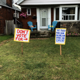
DD: There’s a work on your Instagram page, in which you’re responding to a political sign (now notable by its absence) planted without permission…
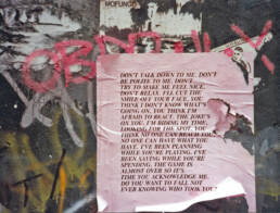
OM: I actually had nothing to do with that. Some of the things I share on Instagram are just found text that really resonate with me. I guess I kind of keep it ambiguous, but that piece I just found. One of the things I like about text art like that is that sometimes you find poetry. In this case it was two hand drawn lawn signs that looked like they were addressing a political sign that wasn’t there, but had been previously. They were saying this person is a liar – we did not sign up for this, we don’t endorse this candidate. But there was nothing there in the middle, someone removed the initial sign and just left the response. It was incredible. I found that in my old neighbourhood, I was just obsessed with it.
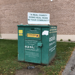
There’s a lot of weird text stuff in that area that I found and loved. There was a clothing donation bin with a big sign on top – and I can’t remember the exact text but it was something like this in quotations, “a real charity in your neighbourhood.” It was just a great misuse of quotation marks. It just came across as so ominous.
I would love it if my art could emulate that experience and play with the confusion of language. I love the way that text – despite being more literal than imagery – still leaves a lot of room for interpretation. There’s still so much room even within a simple piece of text for misunderstanding.
This is tangential but I remember when I was younger, I would write things for school and give them to my mom to read before I submitted them, and she would read them back to me and I would always be so frustrated with her because she would read them in an entirely different tone that I had written them in my head.
DD: That’s valuable information she was giving you.
OM: Oh absolutely. I just didn’t understand at the time. In the moment though I was just annoyed.
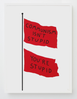
DD: Is there almost a semiotic investigation into the form of the flag for this piece, with its militaristic and nationalistic connotations, sort of undermined…
OM: A little bit. One of the prints I had made just says “Communism Isn’t Stupid, You’re Stupid”, with a big red flag and that one plays with those ideas.
DD: Two red flags – with the second as almost a snarky afterthought.
OM: Yes, two red flags. As if the message wasn’t clear enough the first time. That one is probably the closest to actually engaging with the conventional purpose of the flag. The rest of them are just kind of skirting around it. I see them more as hijacked flagpoles where someone’s personal message is being broadcast in place of these more authoritative, authoritarian or like, nationalist ideas. As though someone thought “People tend to respect the flag. Maybe that will work for me too”.
DD: And then there are a few that respond to the formal properties of the flag, like “Tiny Flag” or the double flag of “Communism Isn’t Stupid”, and the one that’s inversely printed.
OM: Yeah, for sure. The Tiny Flag just kind of made me laugh. I thought about staring up at a giant flagpole trying to squint up at the text and being underwhelmed at how literal and kind of pointless it was. I feel there’s something powerful sometimes about a lack of a deeper meaning.
DD: The found lawn signs remind me of an interview that Holzer gave, outlining an early revelation in her practice. She describes walking home in Manhattan and seeing a handmade sign that some unhinged person had affixed to a lamppost. Some convoluted conspiracy theory or something, in a place where you expect to see missing pet posters or ads for garage sales. And she said that it stopped her dead in her tracks.
And that always struck me as a great origin story – seeing something that stops you dead in your tracks and wanting to replicate that for viewers.
OM: Yeah, that’s awesome. I also like this idea that anyone really has the tools to make a captivating text piece. There’s a pretty low bar of entry to print something on a piece of paper and pin it up but it can still be so powerful. There’s something also very freeing about placing work out in public like that. Once you place a sign somewhere or put something in a public space it doesn’t really belong to just you anymore.
Like when I put up signs a lot of the time I don’t expect to see them back. They exist out there, and it’s up to the public to kind of deal with them or not.
DD: Is it – in a way – returning some of these things to the public realm? Because I imagine a lot of the texts are found, or overheard….
OM: Yeah, kind of. And a lot of the stuff is reinterpreted, or sometimes just purely found text or found image, or a combination of the two.
DD: The very nature of them being published and produced and properly printed rather than scrawled gives them this sort of unusual form of authority.
OM: For sure. I find anytime something looks expensive, people tend to treat it differently. You could put the exact same sentence on a printed flyer or a full sized printed flag and people will read them completely differently. The production carries a sort of significance that forces people to engage with them and take them a little bit more seriously, even though they might not be all that serious.
DD: How does this project for Culture Days fit into your broader practice?
OM: Well It’s quite literally expanding part of my printmaking practice from paper to reality. Without the support of Culture Days I wouldn’t have the ability to produce work at this scale. Having the festival staff to help find partners and handle logistics has been great. I haven’t had the means to realize at this scale before. It’s a one man operation, so being able to scale up and work in this way has been exciting.
DD: …inadvertently exposing the nature of the authority of signage. It’s like the A. J. Liebling quote that freedom of the press is guaranteed only to those who own one.
OM: Yes, well, for now I can settle with just renting.
Ontario Culture Days runs an annual Creatives in Residence program. Part of the work of the Creatives is presented during public events for our festival of free arts and culture programming across Ontario.
Find more information on Owen Marshall’s project here, and read more about the 2023 Creatives in Residence cohort here.